
A laggy site rebuilt in clean code
to feel like a showroom.
Gierre Mobili’s old website was slow and wasn’t built around how customers browse. We rebuilt it from scratch in HTML, CSS, Bootstrap and PHP, with no plugins to slow it down.
- Client
- Gierre Mobili
- Industry
- Furniture manufacturing, Italy
- Services
- Custom development, UX layout, galleries
- Stack
- HTML, CSS, Bootstrap, PHP
A beautiful product range,
held back by its website.
Gierre Mobili designs and makes bedroom and living furniture in Italy. The old website didn’t show that quality, and it didn’t work for the Italian customers it was built to reach.
A laggy site
Pages stuttered and loaded slowly, which is fatal for a catalogue built on large photos.
Outdated plugins
The site leaned on old plugins that slowed it down and carried maintenance and security risks.
Not built for visitors
The layout wasn’t designed around how people actually browse furniture collections.
A big range to show
Many collections, compositions, dimensions and finishes needed to be easy to explore.
No plugins, no templates.
Just clean code, built for the customer.
Start with the customer
We mapped how Italian customers explore a furniture range, from collection to composition to finish.
A unique layout
We designed a layout from the visitor’s point of view, with big imagery and a calm, premium feel.
Hand-coded
Built in HTML, CSS, Bootstrap and PHP, so every page loads only the code it needs.
Better galleries
Custom galleries across the whole site show rooms, compositions and details beautifully.
Made for Italy
Italian-first content and navigation, with an English option for international visitors.
Tested and supported
Responsive across devices, checked page by page, with support after launch.
A showroom feel,
coded by hand.
Every page below is custom built. None of it relies on a plugin.
A homepage that sells the look
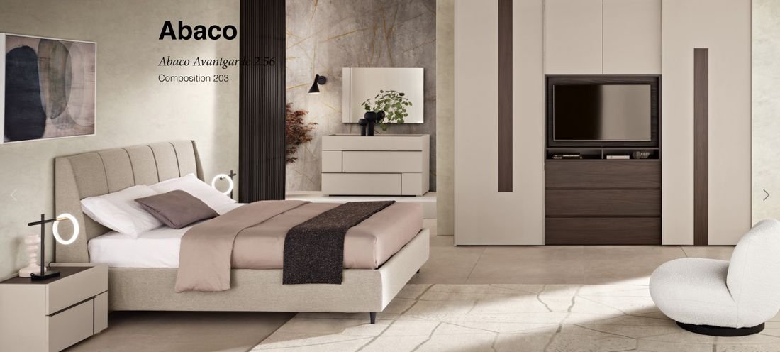
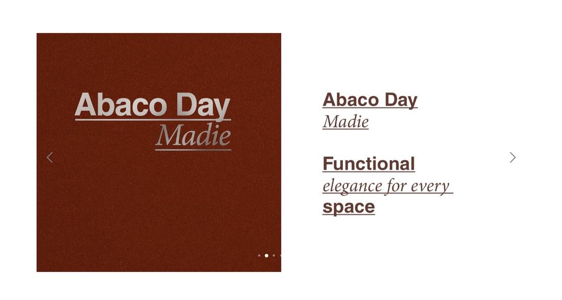
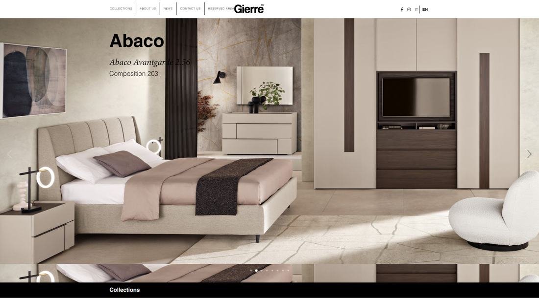
A full-width slider opens on real room scenes, followed by a collections carousel that invites visitors straight into each range.
Easy to find, easy to browse
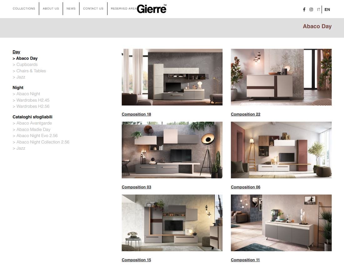
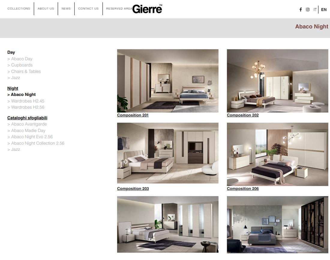
A simple side menu groups the range into Day, Night and browsable catalogues. Each collection opens into a clean two-column grid of compositions.
Pages that tell the story
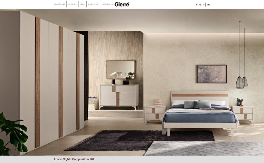
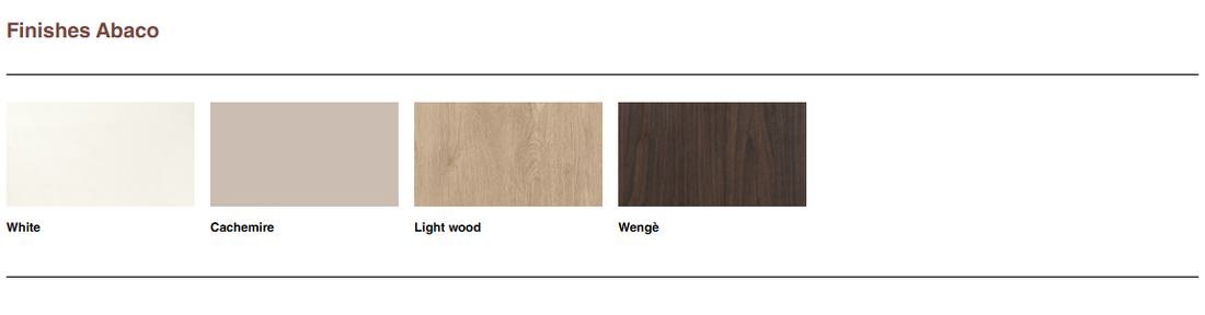
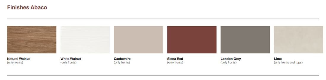
Each composition opens with a large hero image, an editorial line, supporting photos and finishes shown as real colour swatches.
Dimensions where customers need them
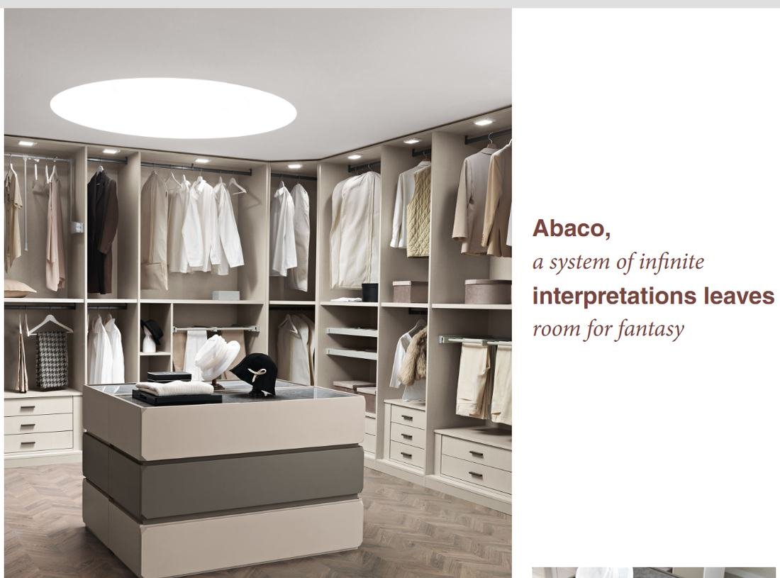
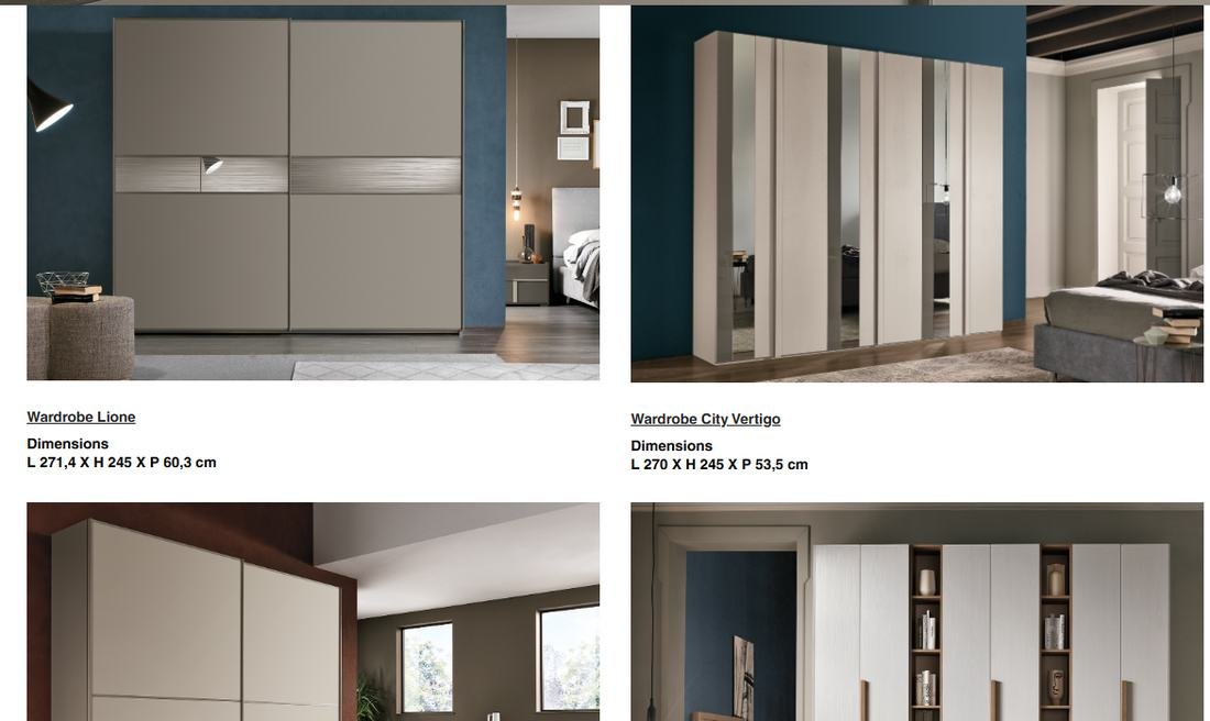
Wardrobe and walk-in pages show every composition with its dimensions right beside the photo, so buyers and retailers can compare quickly.
Galleries and finishes that sell
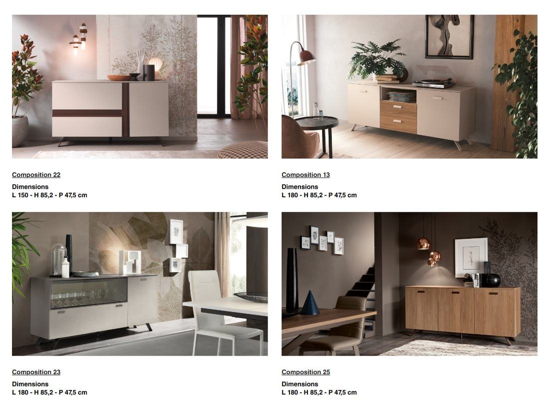
Large, consistent image grids make every piece look its best, with finishes labelled clearly so customers know exactly what’s available.
Fresh content, easy to share
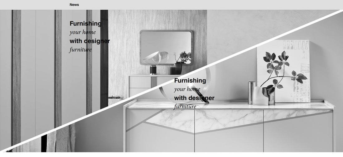
A news area and social links for Facebook and Instagram keep the brand in front of customers and make new compositions easy to share.
Lighter, faster and
built for customers.
Smooth, lag-free browsing
Clean, hand-written code means pages load only what they need, even with large photos.
No plugin dependency
No outdated plugins to break, patch or pay for.
A customer-first layout
Collections, compositions and finishes are easy to explore.
Better galleries
Rich image grids across the entire website.
Made for Italy
Italian-first content that speaks to the client’s real customers.
More from
our work.
← All case studiesHave a project in mind?
Tell us what you are building and we will come back with a clear plan. No obligation.